The Second Link
Two opposing curves share a short spine. Open ends keep the shape moving, while the joined silhouette makes a clear S in one color.
Forest symbol SVG ↓ · Reversed symbol SVG ↓
The SoldBefore identity / 03
Two open links, joined into an S. A simple expression of something useful passing from one owner to the next.

Vector masters, transparent PNGs, icons, a social card, color tokens and the locally hosted display font, with usage notes and its open font license.
Two opposing curves share a short spine. Open ends keep the shape moving, while the joined silhouette makes a clear S in one color.
Forest symbol SVG ↓ · Reversed symbol SVG ↓
Open, human letterforms with room to breathe. Lighter Bricolage Grotesque lettering and a deliberate pause between Sold and Before balance the compact symbol. Every letter is outlined.
Primary lockup SVG ↓ · Transparent PNG ↓


The compact icon has wider terminal gaps for small displays. Use the standard symbol from 24 pixels high, or the small-size symbol at 16–23 pixels. Keep clear space of at least one link stroke around the logo. Preserve its proportions and use one solid color with clear contrast.
Small-size symbol · App icon SVG · One-color icon · 512px PNG · Reversed lockup
Horizontal and stacked signatures, small-size masters, reversed and one-color marks, app icons, an outlined social card and a portable identity sheet. Use the supplied artwork so the proportions and spacing stay consistent.
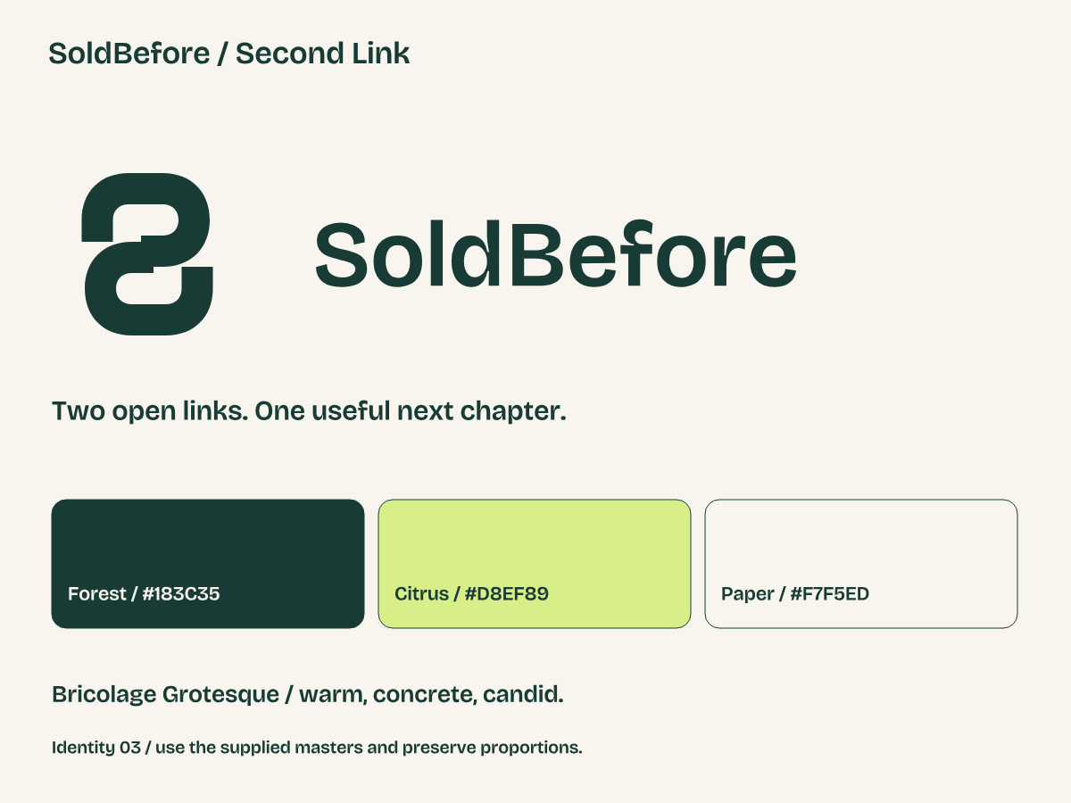 Download the identity sheet PNG ↓
#183C35#D8EF89#F7F5ED#17251FForest anchors the identity. Citrus adds energy to stamps and accents, paired with dark text. Warm paper leaves space for the objects. Light, Dark, Night and System themes preserve readable contrast and natural image colors.
Download color, typography and spacing tokens ↓
The same ribbon becomes a supporting pattern for larger surfaces. Give it room; keep it away from body text and item details.
Pattern SVG ↓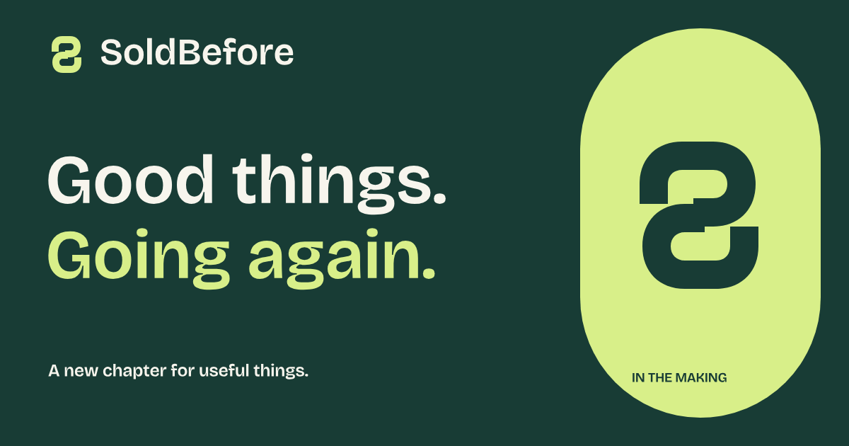
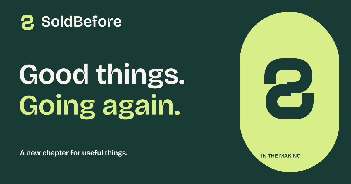
A 1200 × 630 sharing image with outlined display lettering and a clear development status.
Social card PNG ↓ · SVG ↓Warm, concrete and candid. Name the scuff. Explain what was checked and what is unknown. Use SoldBefore as one word, with a capital S and B. The mark represents the brand; it is never a verification badge or proof of a sale.
Item photos should show the actual possession, its condition and its defects. Never smooth away wear or imply an illustration shows something for sale. Our website uses clearly labeled synthetic imagery: an editorial still life and three demonstration items. None is live inventory.
Bricolage Grotesque gives display text its character. System UI keeps body copy and controls familiar. A compact font subset is served from this website, without an external font request. Bricolage Grotesque is by Mathieu Triay and contributors, under the SIL Open Font License 1.1.
This is soldbefore-brand-2, refined after owner feedback on the first direction. The site introduces a product in development. It does not establish trademark clearance, approve the marketplace prototype, or open trading.